I’m sure y’all are pretty tired of hearing about this kitchen redo of ours, and I promise that I will move on very soon. But first, I wanted to answer a question I keep getting that I fully intended to on Friday but completely forgot to include in the kitchen details and sources post. (And then I’ll have a question for you to help with tomorrow. And then I’m DONE! Probably).
So, the question was about our kitchen colors. As in, what are they?
First up, we have the cabinets, which we painted Sherwin Williams Dover White.

I think this swatch looks crazy yellow compared to the real deal because it’s truly just the creamiest, mellowest (NOT Y-ellowest) warm white, and that swatch looks just plain dingy…at least on my computer screen.
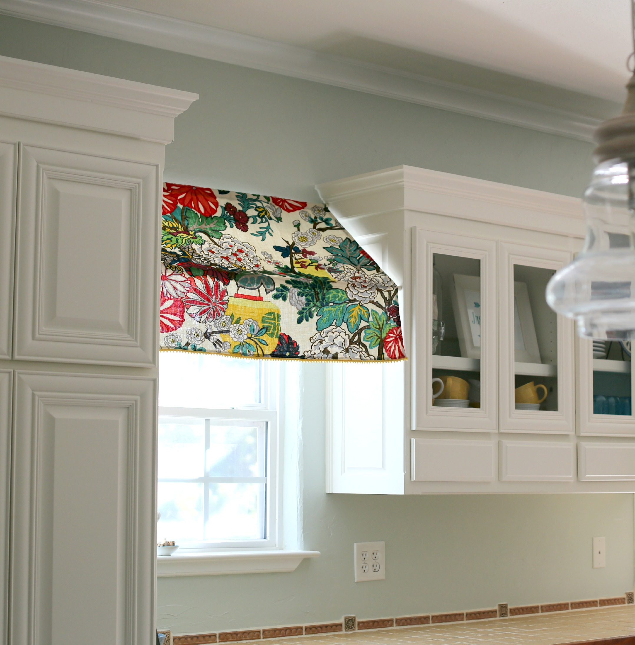
We chose it for the cabinets because we already have it on quite a few walls (it was actually the wall color in the kitchen before we repainted) and, as you can see, it’s a great neutral white without being too antiseptic/blue or gray.
Next up, we have Sea Salt (also by Sherwin Williams…actually all of these are) for the walls.
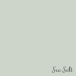
As you can see in the background of this shot, we have this color in our living room too, and I love how it can morph from gray to blue to green depending on the time of day and lighting. The best part, though, is that it’s a beautiful, soothing color even in fluorescent lighting (which kind of sounds impossible, no?)
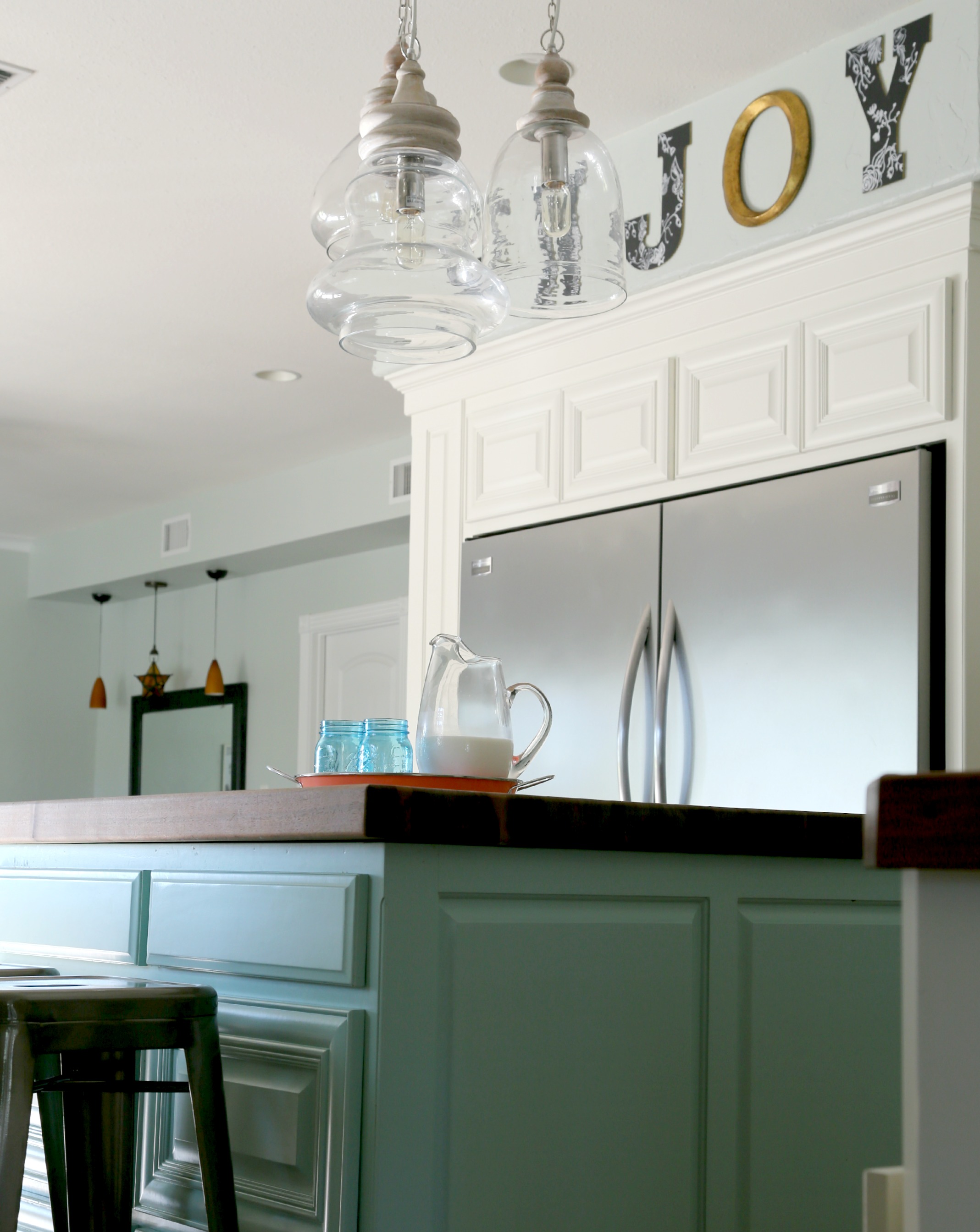
And finally, we have SW’s Aloe for the island. Although, this isn’t strictly the truth.

The strict truth is that I chose this color initially, and Shaun balked, thinking it would be too drastic against all the other soothing colors. He has great instincts, and we usually agree on stuff like this, so I kind of chickened out and had the painters go with the same color at a 50% dilution.
Bad choice.
The color ended up being so pale that I had to point out to Shaun that the cabinets and the island weren’t the same color before he realized it. I didn’t exactly want to go nuts with the island color, but I did want it to pop at least a little!
I had been so convinced that I wanted to go with a soothing sea foam shade, but after the initial flub, I started second-guessing myself like crazy. One Sunday, we went to Lowe’s, and I ended up with a rainbow of colors, using my Chiang Mai Dragon fabric as a guide.
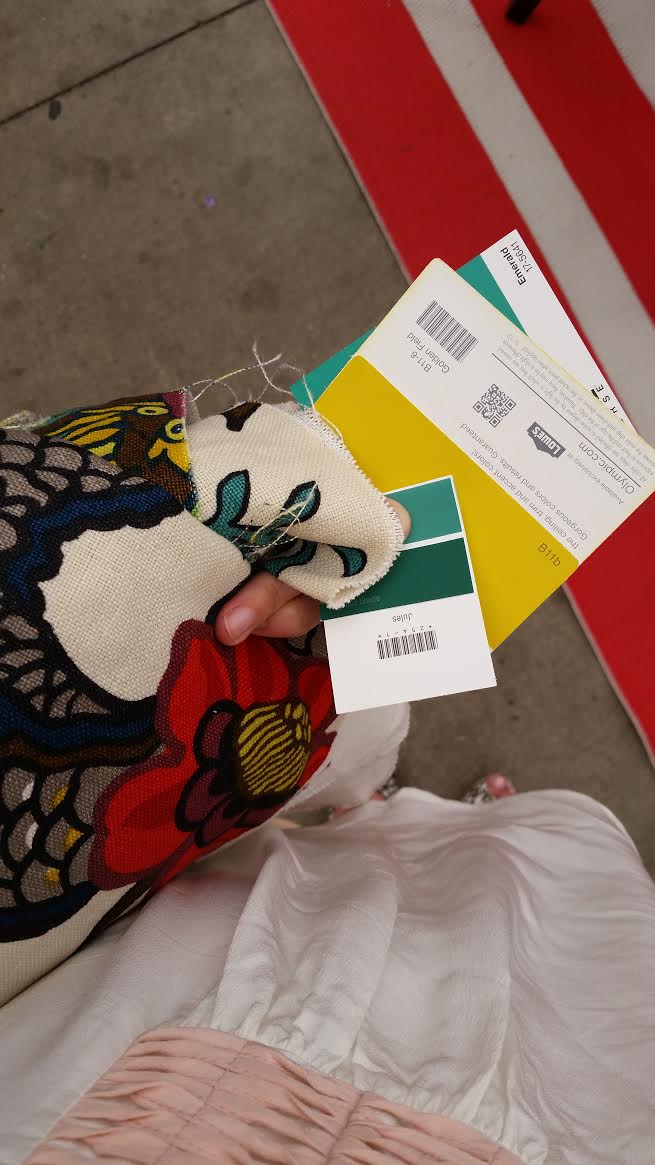
We spent an afternoon rolling all of those crazy colors on the island and got this super-attractive result.
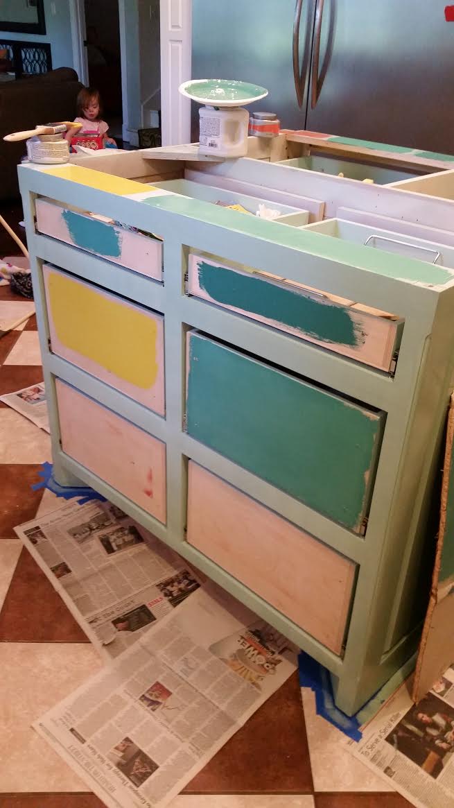
Nothing was quite right, which brought me right back around to the sea foam I’d wanted in the first place (should’ve trusted my gut).
Still, I wasn’t convinced that Aloe color was exactly right (it was skewing a teensy bit more aqua in our kitchen light than I wanted), so we had a custom match made of something rather random…
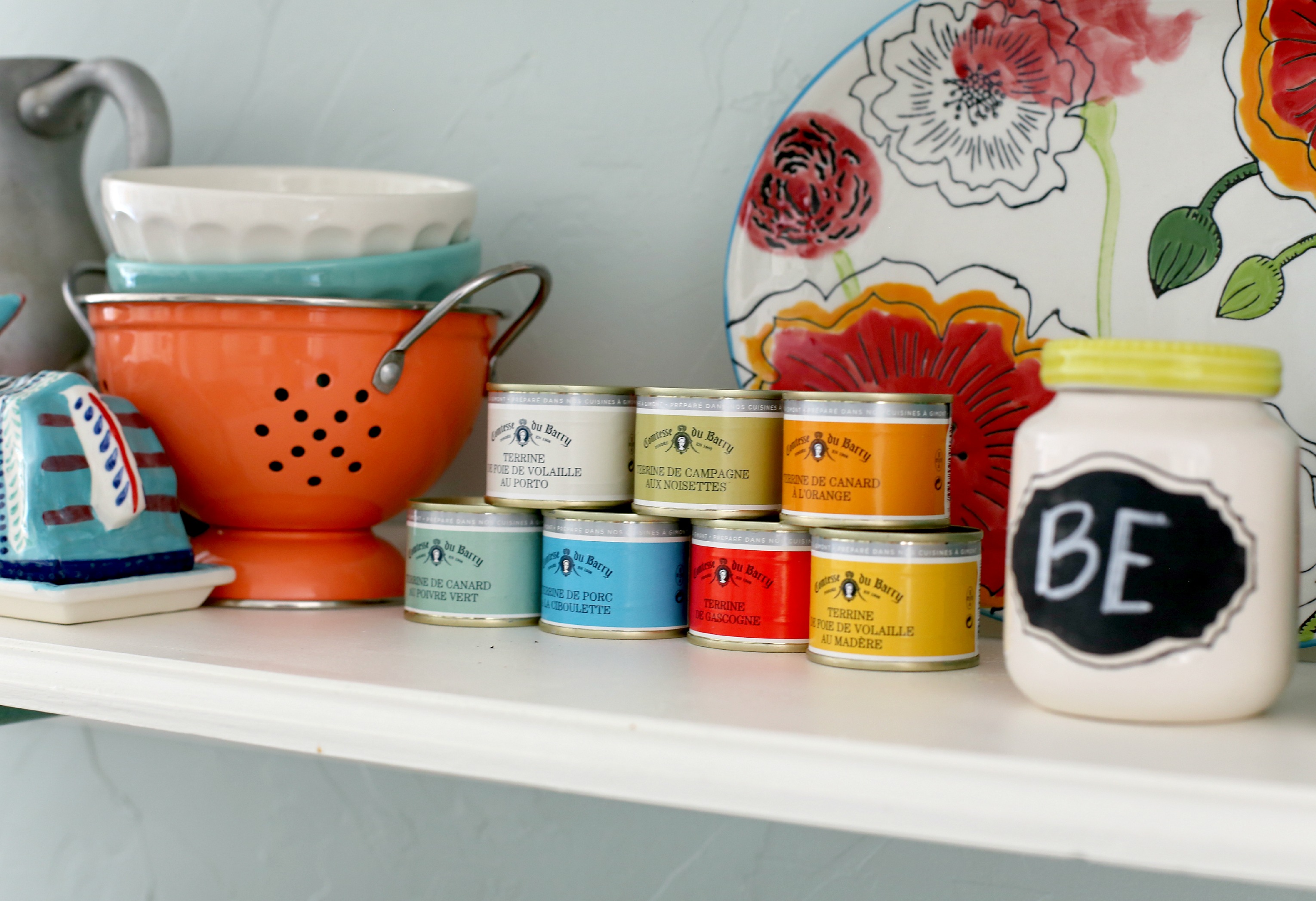
See that little sea foam tin full of disgusting canned meat? (Embarrassingly enough, this was my home decor souvenir from Pairs–essentially cans of French Spam. They will never get opened, but I just loved all the colors together!).
I took the wrapper off and had Sherwin Williams color match it.
And THAT is what color our island actually is.
Which doesn’t help you tons if you’re hoping to duplicate it exactly. But I will say that, if you like the look, and want a place to start, then try a sample of Aloe. It’s a gorgeous color (with its only fault being that it was a bit more blue than I wanted), and is very, very close to the color that we ended up with.
So, there you have it! Our kitchen colors and a hopefully-not-too-boring back story for why one of them isn’t actually the color on our island (believe me, I left out plenty of details about hours spent sanding and hand-rolling and then finally taping and tenting and having a friend come in and spray it anyway. Argh. That island drove me a bit nuts).
Do you always manage to nail your paint colors the first time? For me, it’s almost always a big process to get it right. Which is why certain rooms in my house (ahem, the downstairs bathroom) still need a different color than the first four I chose (I wish I were joking).
im having a problem sendind so if u get multiple im sorry. i love the look of sea salt but in my living room the chip just looks grey. will it look like the chip? i have alot of sun and artificial light. Any suggestions? is there a color very similar w out as muh grey?
the color sea salt i love in pica and want to put in my living room. it has lots of light but looks very grey! is the chip not the same as the color? and is there a way to make it less grey? or do u have a better color thats similar to what i want?
PS Your kitchen looks amazing! Your Dover white looks like the swiss coffee I’ve been using. I absolutely love it!
Ugh picking paint colors is horrible. I always see inspiration photos and I love it and then nothing looks quite like I have in my head. Plus, I hate painting. We’ve been in our fixer upper house almost a year now and I’m finally just doing it because I can’t stand white walls and oak trim. So not me. I have a goal of basically finishing the upstairs by the end of the year. I have a nice long list. 🙂
I am completely crazy with paint colors. I have never gotten sample paint. I have never painted samples on anything. I pick it, I paint it! I am bold with paint. I’m also bold with hair color!! I just picked out a plum color to paint my wall behind my fireplace. Completely random color, big impact! I’ve painted my laundry room pink, armoire and doors turquoise, and bedroom furniture cream. Oh, and my middle boy has black walls in his bedroom.
Oh the stories I have about paint. I think it’s one of my biggest stresses in decorating, which is silly because it can be so easily fixed. Just yesterday I bought some Benjamin Moore in a color called Graphite (warm dark gray) to paint a console table in our upstairs hallway. I’m afraid to start, because if it’s wrong, I don’t have a whole lotta time to redo it. Thanksgiving is at our house this year and I’m using that deadline as motivation to push through some projects. It’s a disaster zone now, but I have hope. 🙂