Oh my word, folks. Y’all are awesome! Between all the great comments here and the 150 (!!!) opinions I got over on our FB page, I definitely have some great ideas for finishing off the entryway decor.
Seriously, thank you. You guys are too nice!
And in keeping with the topic, today, I’m going to show you a little something I whipped up to balance out the red subway art. I love how it turned out, but it’s not quite the right scale to fill the space to the left of the hall-tree, so I’ll just have to keep tweaking until I get it how I like it.
Good thing I like t-w-e-a-k-i-n-g. (I think that’s the 3rd time I’ve made that same You’ve Got Mail reference here on the blog; apparently, I really need to watch it again).
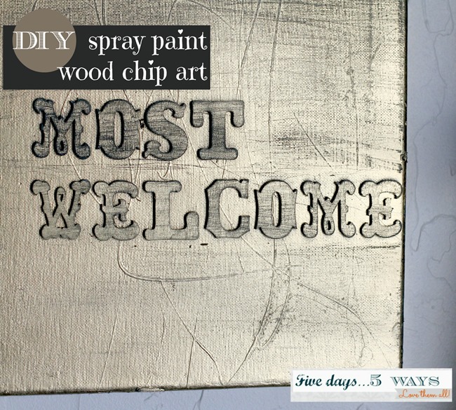
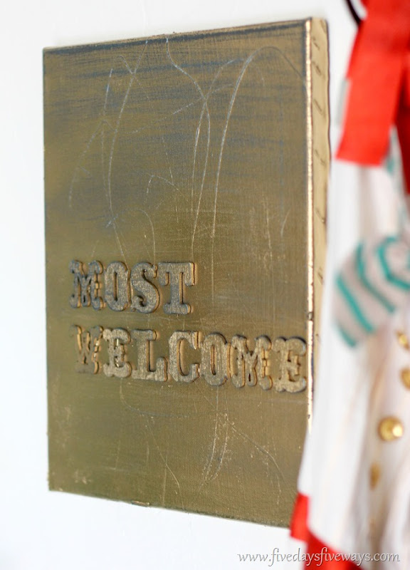
Here’s what I made:
And here’s what you’ll need to make one of your own:
- Canvas (mine was from Goodwill, and it worked great; this really is the perfect project to recycle an old canvas)
- Two colors of spray paint, one light, one dark
- Wood chip letters (I found mine at Hobby Lobby, but any craft store should carry them)
- Hot glue/gun
- Fine grit sandpaper
- Tape measure + pencil + straight edge (not pictured)
::STEP 1::
Use your tape measure, pencil, and straight edge (clearly I went super fancy with my grocery ads) to draw a straight line across your canvas. You’ll use this as the “shelf” for your letters to keep them straight.
::STEP 2::
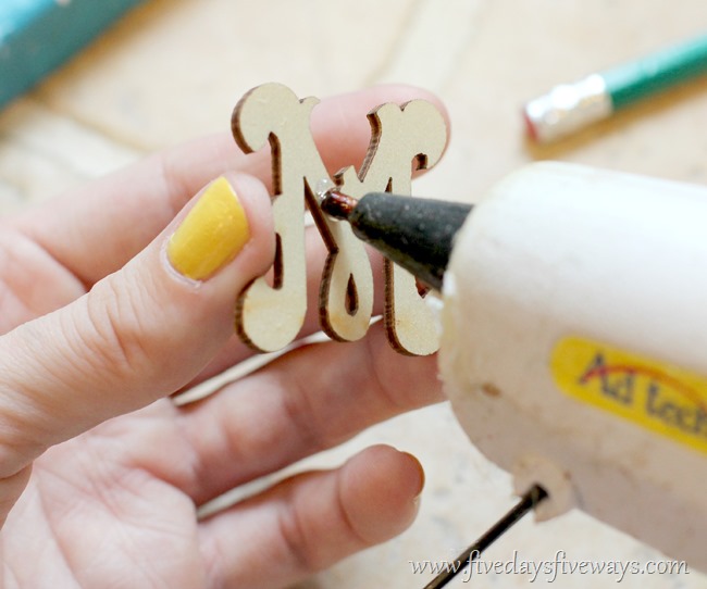
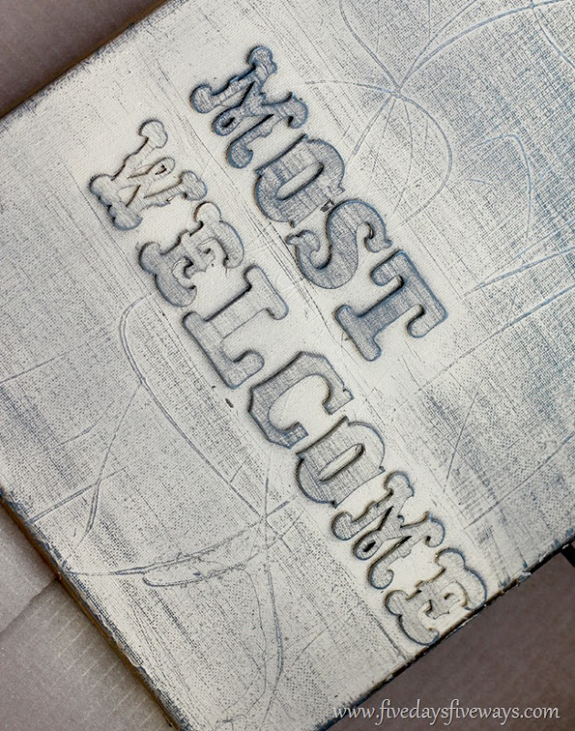
Hot glue each letter to your canvas (I just eyeballed the spacing as I went).
::STEP 3::
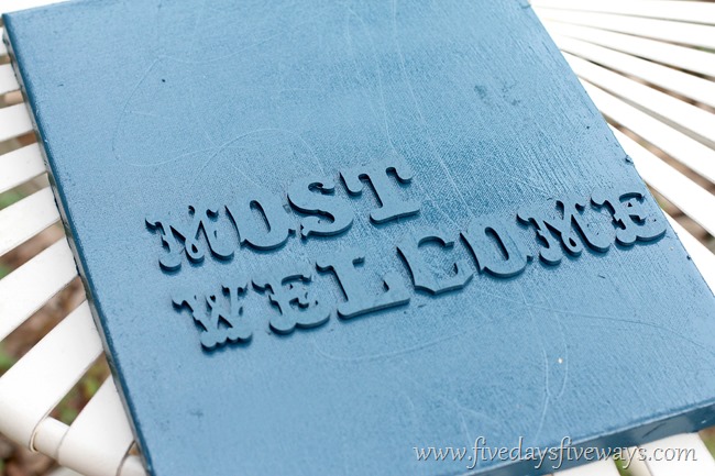
Spray paint the entire canvas + letters with your base (darker) color. Add as many coats as you need to get the color as dark/even as you want it.
::STEP 4::
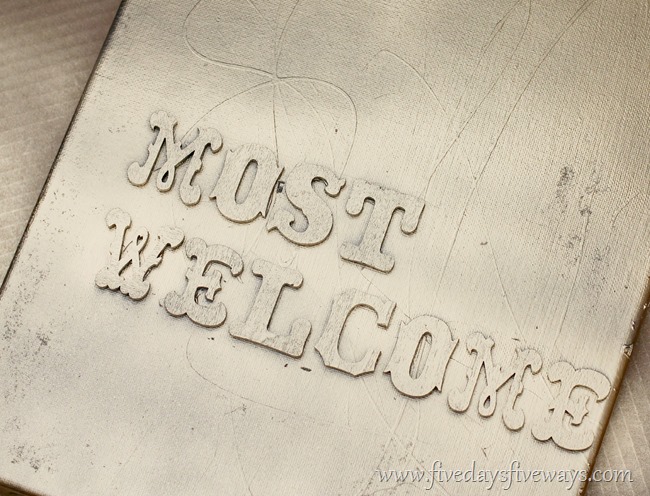
Follow up with a topcoat of your lighter (in my case, shimmery) spray paint.
::STEP 5::
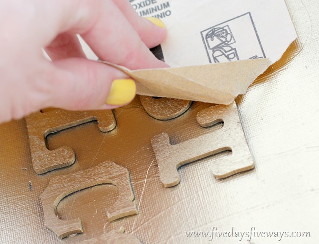
After the paint dries, lightly sand your canvas and letters to bring out the darker color underneath. I did a bit of an ombre effect by sanding more at the top than the bottom, but more than anything, I just kept at it until I achieved an effect I liked.
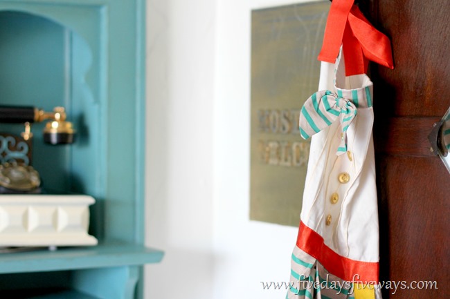
I kind of love the metallic pop against the crisp white wall.
You might recognize that apron from my 2012 Christmas wish list. Yup. Shaun came through on that one. I have yet to use it because it’s so pretty, but some day, I will work up the nerve to expose it to olive oil and tomato sauce (maybe, I’ll start small and bake some cookies first).
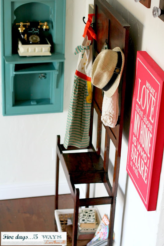
By far, the most common suggestion was to move the disproportionately large basket from the stool to the little shelf below the hall-tree. I don’t know why that never occurred to me, but I’m so glad y’all thought of it because looks so. much. better.
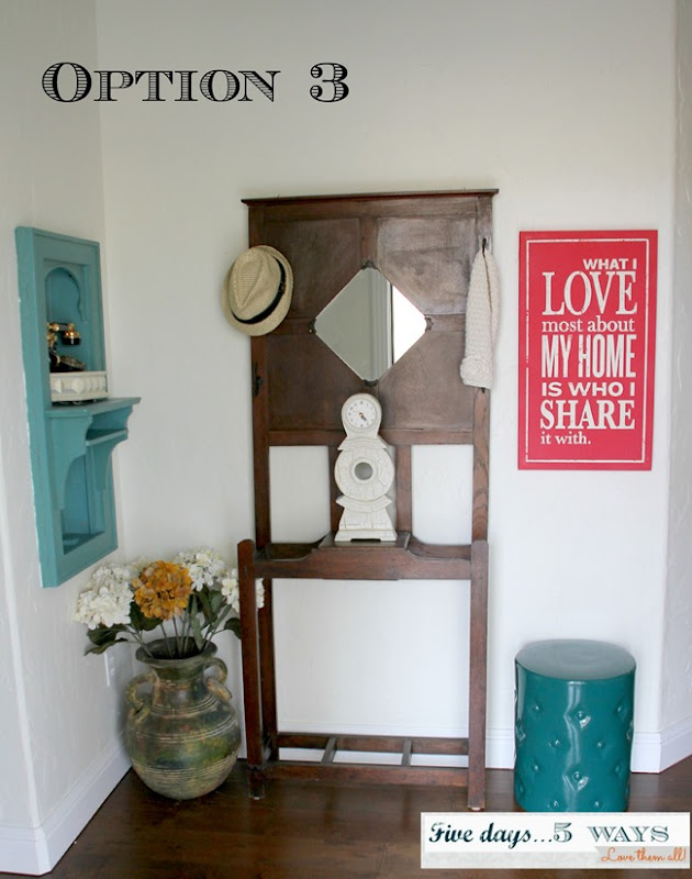
Here is the version that was the reader favorite:
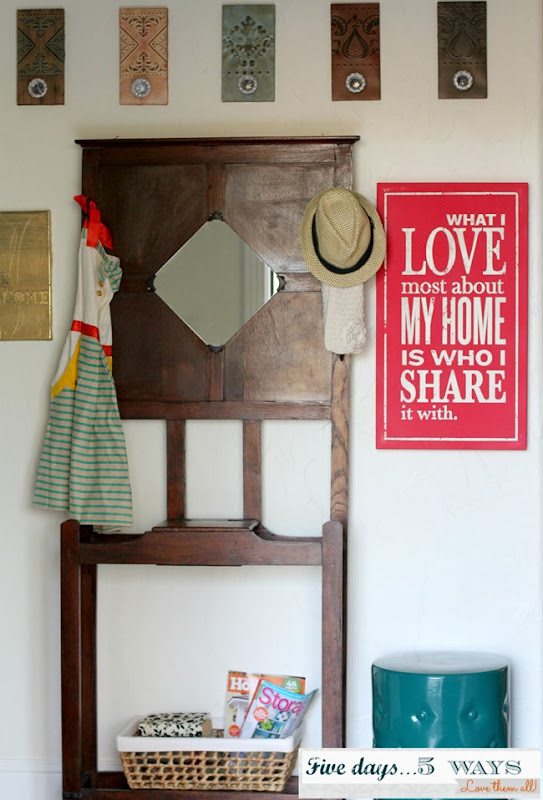
And here’s what it looks like now after my changes so far:
Did you notice that I added the decorative tins back in? Not sure if they’ll stay, but I’m liking them well enough for now.
I’m only showing you this cropped version because I still haven’t solved the problem of the empty wall space in the left bottom corner (every single square inch doesn’t need to be covered, but I do want it to feel balanced, and my DIY art doesn’t quite accomplish that by itself).
So, what do you think? Is the new art a keeper? Are you a fan of the tins back in place? Any other suggestions? I’m all ears!
P.S. I would love to claim credit for coming up with the wood chip art idea all on my lonesome. But I didn’t. I totally ripped off my friend, Sheila’s idea (if you haven’t read the post where I gave you a little tour of her gorgeous DIY-decorated house, you should check it out!).
Linking up here:

Really Nice Bolg! Wood chip and Pellets solution in uk Wood Pellet Suppliers
Love all the options – and that sign is fabulous. What a fun, colorful space. Thanks for sharing at our spring party!
Kelly
I love the apron to tie in more teal and another pop of red. As for the rest it’s hard to tell without a wider shot, but I know “less” is always a good decorating standby if you’re ever in doubt.
Oh man, I love You’ve Got Mail. SO good. Make as many references that you want!! I love the artwork too! I think it’s a great idea to upcycle an ugly, bad canvas from a thrift store. Great idea!
So glad to hear from a fell YGM-lover, Megan! It really has been too long for me. I think I’ll turn it on in the background while I craft this afternoon! : )
It looks really nice! Love the apron. 😉 Is the phone in the phone box real or is it fake? It looks uber cool!
LOVE the DIY canvas art! What a cute idea! I think I could actually accomplish this one…haha! And I think the metallic accent is really great 🙂 I’m pinning it so I don’t forget 🙂
And I do love the improved version…very nice! I like the tiles back, and the apron adds a great pop of color….love it BTW! (I have a hard time wearing my cute aprons too 🙂
What if you moved the hall tree all the way to the left into the corner and then stacked the new “most welcome” canvas on top of the subway art…well, not touching each other, but hopefully you know what I mean. Line them up vertically on the right side of the hall tree?? I always like to add some greenery…brings life to a space. So you could add some low busy greenery in the basket in place of the magazines?? Just a thought, might look terrible in real life but just thought since you asked….grin 🙂
Keep up the great work….you’ll get it just right…know ya’ will!
Looking good!! You have inspired me to do some tweaking of my own. Time to shop my own house! (And You’ve Got Mail – MY FAVORITE. I need to watch it again too!)
-Katie
Yea! I like the tins back up! I’m all for going vertical. Jud
Since it is an entryway, I think that the large jar that was to the left of the hall tree in Option 3 would perfect but instead of the flowers that you had add an umbrella or two. Just a thought. Btw, I love reading your posts!