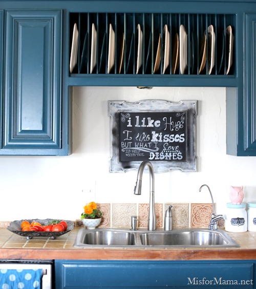
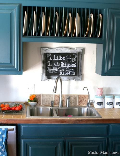
I’ve wanted something cute to fill the blank space above my sink for—oh—a good year now.
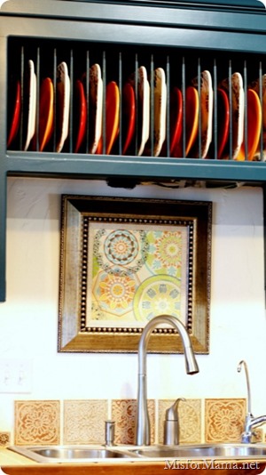
This is what it looked before when I first revealed the kitchen.
It’s fine, but it was a bit too impersonal for my tastes.
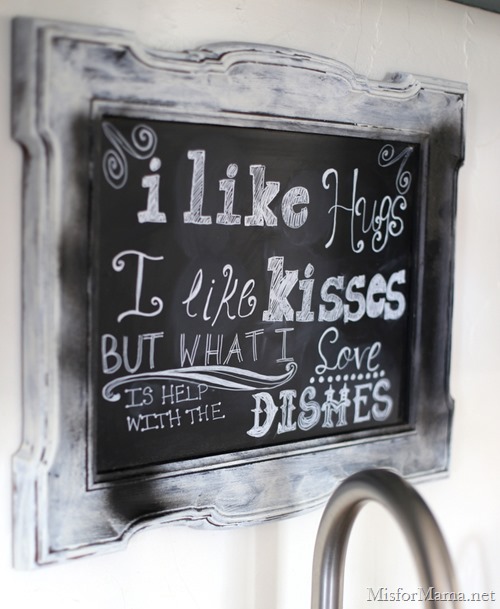
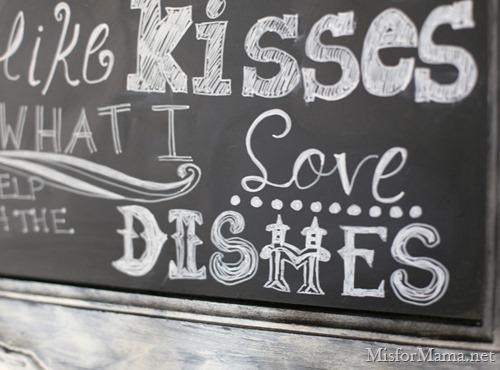
So, what better way to personalize something than with a little chalkboard art?
I read an article in some sort of design magazine the other day that assured me that the chalkboard obsession is on the wane. But I don’t really care. If I still like it, I don’t mind if it’s not fashionable, so I tried my hand at a quote which was just perfect for over-the-sink placement.
Who knows? Maybe it’ll inspire my family? (Although, honestly, the kids already unload the dishwasher regularly, and Shaun helps when he can).
The FB and IG crowd loved it, so I thought you guys might want to see it too.
(Plus, I’ll ask for you help in a minute; I’m sneaky like that)
The frame is a Goodwill find (maybe $2?) that I primed before spray-painting the glass with chalkboard paint.
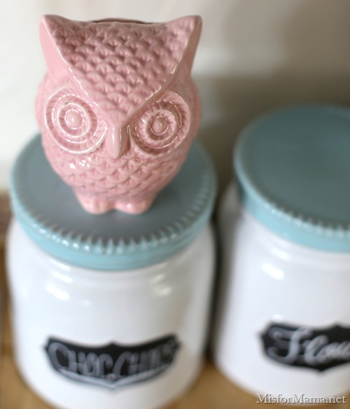
Another fun find (from a flea market in Riverside was this vintage owl coin bank.
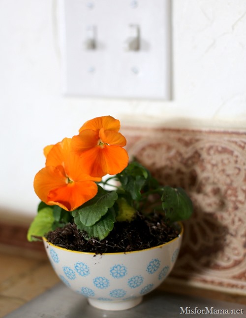
Oh, and one more: a $1 bowl from Marshall’s with a happy little mustard-colored pansy stuffed inside.
The only thing is, as I mentioned, I had primed the frame only, with every intention of painting it a fun color.
Only when Shaun saw it, he thought the mottled black and white look was intentional and even looked good.
And I don’t necessarily disagree.
Especially if I had a French country kitchen with lots of neutral colors and chippy paint finishes.
But with my colorful kitchen, I really feel like the frame needs to pop a bit more against the white wall.
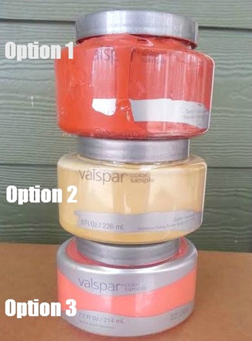
I scored these three sample pots from Lowe’s on sale and feel like any of the three could work well with the other warm, bright colors I have going on in this space.
So, this is where you come in.
Out of the following options, which would you choose?
a) Option 1
b) Option 2
c) Option 3
d) Leave it alone
Are you over the chalkboard trend? I never dived in whole-hog to begin with, so it still seems fresh enough to me.
1 or 3. Cute!
I love the colors of your kitchen! Mine is the same but with some green.
So…It is my humble opinion that, bc it looks like you already have a lot of variations of orange/coral in the immediate vicinity, you might consider doing the frame in the yellow, just bc it is a good contrast against the orange/coral that is already there. Plus, the yellow against the darker tones (orange/blue) tends to make it “pop” and draw your eye to that spot on the wall a little more so than the darker colors would.
However, if you’re not looking for it to have that pop effect, I think the first one would be the better of the orange/coral.
My question is, what are you doing with the artwork that’s being replaced by the chalkboard? (It would be perfect in my kitchen if you’re wanting to get rid of it! Just sayin
they’re all good, but I think #2 would stand out the most…I think our eyes are drawn to the orange shades since that’s the accent you have in the picture; but I think the yellow and turquoise are perfect combos!! 🙂
Option 1!!!!
I personally think option two would look awesome with your kitchen cabinets. That being said I am crazy obsessed with yellow only next to blue/green, teal if you will ( just a lighter version)!
I’ll take it for MY kitchen, and then you don’t have to change a thing, because I love the original finish. : ) If you insist on keeping it, it looks like the 1’s have it. I have to get that saying up in my kitchen TODAY.
Option 1! The frame IS great, but gets washed out by the chalkboard art. That frame with a bright print inside would be awesome.. I know…you needed one more project 🙂
Option 1 seems to be popular and it WAS my first thought but then I looked back at the whole kitchen pictures again and decided maybe 2 would be better for more variety. Looking at the whole room you kinda have two main colors (blue and red-ish colors) I think for the sake of not getting boring I’d go with the yellowish one. I also like it as is but probably not in that room.
#1 for sure!
Option 1 because we want everyone to see this message and take it to heart! Help mama with the dishes! Yes! Do that!
First choice option 1!! Second choice option 3. LOVE!!
#2, I love, love it with your color of cabinets!
Option3 I love the color coral. but before you paint it please take one more look. it needs to be bigger. hope I didn’t throw you. I love the chalkboard part and what it says just needs to be bigger for the space
Way over the chalkboard thing. It’s always struck me as too contrived and when everyone in blog land starts doing it, it’s time to move on. “keep calm and…” anyone? Color choice 1 would be beautiful!
Definitely option 1
I vote for option #2!! I am a big fan of chalkboards. I have a huge one in my kitchen where I write a weekly Bible verse and menu. I also have a small one in my master bath so I can leave my hubby messages;)
#3 – LOVE that coral color!
Option 1! I immediately thought the frame needed to be orange.
Option 3. It’s okay as it is, but I think it will really pop with option 3.
Albeit unpopular, I think you should leave it as is. I’m with Shawn, it looks great!
TWO. Even before I saw your choices, that is approximately the color I was thinking would look good.
Option 3. And no, not over the chalkboard thing – but then again, I loved it before it became “a thing” and I will undoubtedly love it afterwards too – so much better than dry erase or good ole pencil and pen or labels!
Option 2 for sure. The area needs a contrast. Don’t you think the chalk is going to get smudged there though? Water will splash up on it though it’s totes adorbes!
I like option 1 or 2. I love the quote so much . . . if I didn’t have a window over my sink I might have to steal this idea, haha. 🙂
I have to go with none of the above……I have been loving gold accents so I have to say spray paint it gold. Rust oleum has a great one! If I had to choose, though…..I’d say option 1….it turned out super cute! Love the saying and your lettering:)
I like the chalkboard look. As long as you are happy with it, don’t worry about the latest trends. 🙂 I like color #1 best. A nice pop of color. 🙂
Option 3 🙂
Definitely option 1! Love it!!
Darling! Option 1 is my first choice. Option 3 is my 2nd.
option #1
I love option 1 the best!
One!
1 or 3!
I put chalkboard paint on anything that holds still! Good thing my kids don’t hold still much or else… 😉
#1. And btw, we have the same type of counter top. I can’t say I love mine 🙁 The grout gets so dirty!!
Option 1
I like option 1 the best, but really, any of them would be fantastic. I don’t care if the chalkboard trend is ending, do what you like! I’ve had a chalkboard over my sink ever since we remodeled the kitchen 8 years ago and have always enjoyed putting encouraging words or Bible verses there. That was pre-trend, so maybe I’m a trend setter? You’d lol if you knew me in real life because that’s SO not the case, haha!
I think Option 1 would look great with your cabinet color.
Option 3!
Amber @ http://www.AverieLane.com
I like option 1! Your sink area is so cute.
Option 1 – I love a brighter color for a frame!
I think option 1 is definitely the best choice. X
My first choice is #3, second choice is #1. I agree, definitely needs a big POP of color! #2 is nice, but kind of blah in my opinion.