It occurred to me a little while ago that I had never shown you our updated entry hallway. We definitely talked it out when it comes to what you see when you walk into the entryway. But as far as you guys know, this is still what it looks like when you turn and look down our hallway.
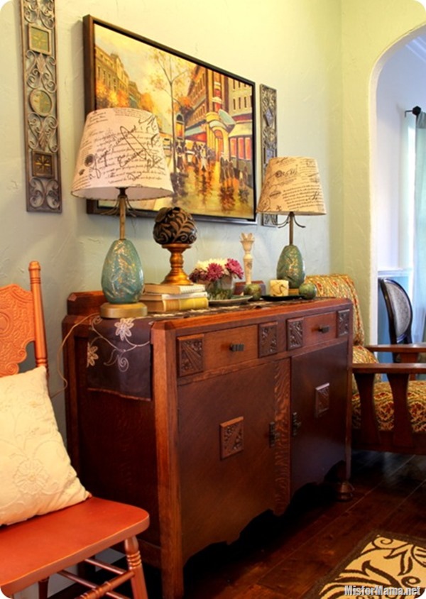
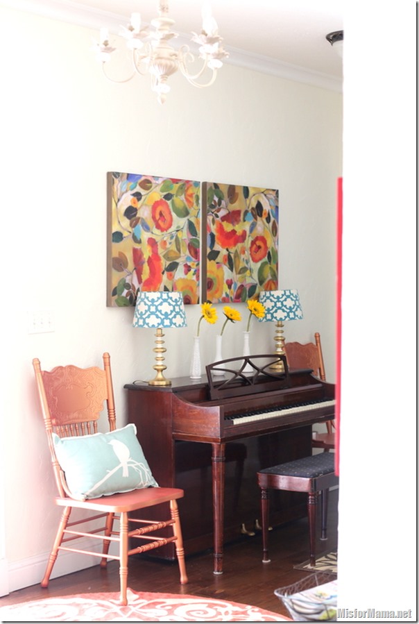
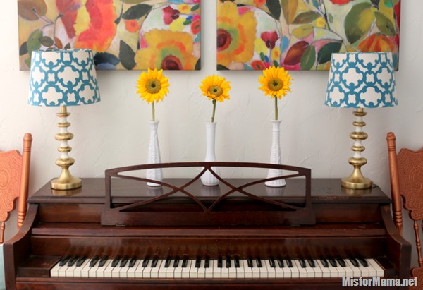
As much as I love all the warm colors going on in there, it was all just a bit too crowded and dark, so when I found a small piano perfectly sized for the space for a steal on Craigslist, I booted the buffet to another room, scooted the piano in, and here is what we have at the moment.
So, what changed besides the piano/buffet swap? Well, we changed the wall color from Benjamin Moore’s Quietude to Sherwin William’s Dover White.
I love how much the white opens up the narrow space.
I also stole the Anthro rug from the breakfast nook. It’s a much better fit in terms of size and shape here.
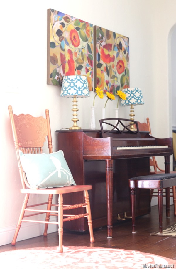
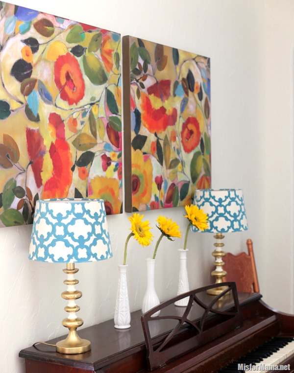
Plus I replaced the wall art.
Kim Parker is one of my favorite artists, and it’s possible to score reasonably priced reproductions of her work at places like Ross and Marshall’s. I have a couple of small prints, but I’d been on the hunt for something bigger for, literally, years when I stumbled across these two huge ziclee prints of her Garden Fantasie piece at Garden Ridge for a great price. You better believe I did a great big ol’ happy dance, complete with squealing (on the inside, of course) and proceeded to do my best to shove both of them in the tiny basket while casting furtive glances around for any competition.
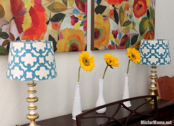
If you look closely, you’ll see that they’re actually the exact same painting, just hung in opposite directions. Works for me!
In case you’re wondering, both the lamp bases and shades are from Target, but I repainted the bases with white and gold (they were black).
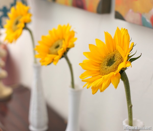
Also, in case you’re wondering, sunflowers are pretty much an instant pick-me-up.
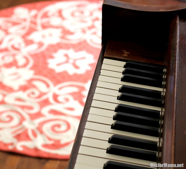
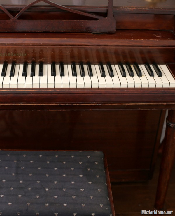
Of course, the biggest change is that cute little parlor piano that I scored, bench and all, for $60 on Craigslist. My boys have been taking piano since the fall, and they both really enjoy it . So, the piano’s staying.
However.
I’m not as thrilled about the wood finish (pretty worn) or color (a bit too cherry for my tastes) or the stained and dated bench seat fabric.
Which is why I plan to change both.
Which is where YOU GUYS come in!
I have less than zero interest in attempting to restore the piano’s finish to its original stained glory. That would involve stripping and sanding and all other manner of unpleasant sounding “s” words. (HA! I just realized how that sounded, but I was not thinking that).
Nope. I’m definitely leaning toward slapping a coat of paint on this little girl and then recovering the bench in something cheerful.
So, the question is what color should I paint Annabelle? (Yup, just decided that right this second).
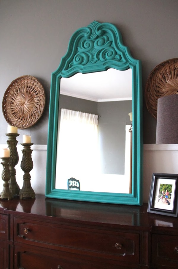
I have a few options in mind, starting with Annie Sloan’s chalk paint in Florence.
Mandy painted a mirror in this shade, and nobody around here should be surprised to know that I love the deep teal-y turquoiseness of it.
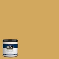
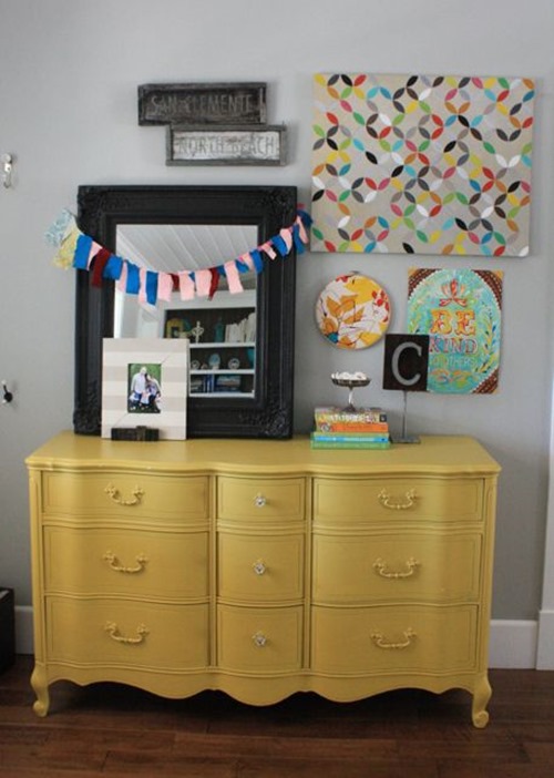
Another fave is French Pale Gold by Behr.
The Pleated Poppy used it on a dresser in her entryway, and I really like the mustard tones in it.
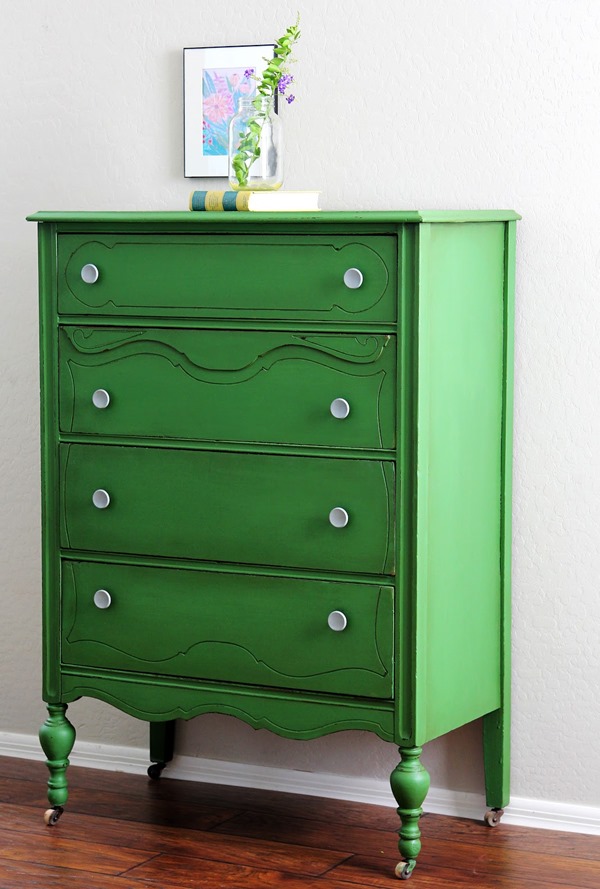
With all the color options in the paintings, I also think a really true emerald would be pretty great.
Something like this milk paint in Tavern Green, perhaps?
If that color doesn’t look too emerald to you (me either), here’s a gorgeous dresser in the shade from Natty by Design.
OBVIOUSLY, these are not my only color choices, but they are three I love.
What I would also love is to hear what color YOU think I should paint ol’ Annabelle.
So, would you choose:
B) French Pale Gold by Behr
or
D) None of the above (preferably with a suggestion on your own).





#3! Green is my teal…
I could not bear to paint such a beautiful piece with so much character but if it must be painted definitely choice A 😉
I vote B!
I love painted pianos!! They add so much personality and don’t you think it would just seem more fun to your kids? I do. 🙂 Love the Kim Parker art too.
Florence! In fact, I have a chair I am planning to use it on!
My first thought was “paint a piano?!!” (Horror) but then I thought “why not?” Then I thought “but it would lose the charm of the wear it’s showing” but then I thought… “give it a few years and it will get it’s own natural distressing that shows a new generation of use/love” then I thought… well u get the idea, but actually my first color thought before even seeing your options was the green. I thought u could use gold to highlight the cool book rack (like just the flat front like they do) and the designs on the legs and maybe use a nice fabric with gold in it for the seat… OR like the stain stuff you put over paint to age it… I think the big issue is going from all the character it has to making it look pristine and kinda un-used/unloved… also, would not want to take on the task but you have a lot more paint experience than I do, so… i look forward to seeing what you go with.
I love “Summer Rhapsody” as an option! This was the color my friend painted her inspiration piece for her business, The Painted Piano! Of your options, I like Florence or the French Pale Gold!
https://m.facebook.com/ThePaintedPiano?_rdr
A – paint won’t hurt the sound. Black is so typical – I think you are too colorful for that!
Florence is one of my favorite Annie Sloan colors, but I think the green would look amazing under your prints. Growing up we inherited my Grandmothers piano, and my brothers and I hated it. My Mom finally broke down and let us paint it purple, and for some weird reason practicing was so much more fun. We loved being the house that had the purple piano, and our friends were sooooo jealous!
I am so happy you are doing this because I, also, am in the planning stages of painting our piano! I got ours for free, on the curb of someone who couldn’t find anyone to take it AND move it! Anyhoo, I’m planning on a greige shade to go in our renovated living room…
So, for you, I lean toward the turquoise color…very you and would go well in your house, with that rug and there seems to be just a touch of turquoise in the picture, so it would bring it out…
Can’t wait to see what you pick….DEFINITELY paint it!!!
I think you should just polish the piano and then change the bench seat fabric to a solid color, perhaps emerald. Can’t wait to see what you end up choosing to do or not do!
I don’t think there’s anything wrong with painting a piece like this. Go for it!!! Florence 🙂
I’m also on the “DO NOT PAINT” team. I think it’s beautiful as it is. Sorry. 😉
I vote not to paint it! But if you absolutely must, emerald is the way to go.
I love the corner that you’ve redone!
My choice for the piano is D – leave as it is, polish it with oil to shine her up. And then paint the bench with the C color for a bright pop. It would still give you the bright color, but it wouldn’t be nearly as much work. 😉
I’m in the don’t paint it camp. Some things should just be left alone. I agree that a complete refinishing sounds like torture. I love the worn look of its original finish, but you could also lightly rub on some stain into the dings and scratches if that’s what’s bothering you. If you must paint it, a pale gold or black I guess would be my suggestions. Good luck!
a. When I first saw the piano picture I thought, you should paint it teal!
So funny to read this post today, since this weekend I got a super cheap craigslist piano as well, and totally have that Natty by Design dresser pinned as color inspiration! That is definitely my vote. I wouldn’t paint a piano I paid more than $100 bucks for, but I don’t see anything wrong with brightening up an old, inexpensive piece like Annabelle. Please don’t paint her black!
Green
I would paint the piano french pale gold and the bench Florence
I’m with the please-don’t-paint-the-piano-ers. Unless you paint it black. Black goes with everything and will make it look new without cheapening it with color. A piano is such a classic piece that turning it into something trendy seems wrong somehow. Let our decorations around it provide the color and trendy fun you’re looking for.
But that’s just my opinion. 😉 It’s neither my piano nor my house.
Please don’t paint it! It looks beautiful like it is. =)
I really like it unpainted (more timeless), but if you’re set on painting it, I like C: Tavern Green!
I vote D with a loud resounding DO NOT PAINT intertwined! Obvs I’m a big fan so this statement isn’t coming with any disrespect. I’ve seen plenty of painted pianos – both on the interweb and in person and they are never ever as beautiful as when in their natural glory. Just a suggestion but perhaps start with a DIY home remedy for fixing furniture imperfections – “recipe” is a mixture of 1/4 C vinegar and 3/4 C olive oil – and live with it for a while before making any changes.
Ooh, I’m a big piano person. I’ve played and taught for years. I really struggle with painting a piano. I completely agree that refinishing as in staining is too much work, but I would be hard pressed to paint it a color. I guess, in my mind, it’s what you want to do with it. You didn’t pay much for it, so if it’s really just at ‘cheap, practice piano” I would do the teal, but personally, I would maybe just buff, polish, and change the bench, not the piano. FWIW:)
Better just use a quality wood polish/wax and leave Annabelle as she is. I agree that painting is cheapening the look of a fine piece of furniture. You have enough color going on already.
I am with the other piano lovers…if you must paint it, paint it black.
B really makes it majestic the way a piano should be. However, I love the green color of C. No more turquoise. Too much. Its becoming too trendy
A or C ….maybe A because you like that color so much . That way if you move it to somewhere else in the house you would still like the color scheme
A, A, A did I mention A?
Love A or C… B would be too much for me…
My choice is D. Please don’t paint that beautiful piano!
I confess that the thought of painting a piano is a really tough one for me to swallow… I actually love the battered look on her. She looks so loved and well-used. Kinda like the Velveteen Rabbit. 🙂 If you do have to paint her, I would like to suggest something less vibrant than the three you’ve shown us. Maybe even just a nice black. A piano is a classy piece of furniture; I feel like such a bright color would cheapen her. I love all your bright colors everywhere, don’t get me wrong… but as a piano player, I wish you would reconsider. She’s beautiful just the way she is. 🙂 [Oh, and I LOVE how you just rotated the second painting and it looks like a set! Gonna have to use that one!]
C would be unexpected!
Definitely A…. but then, that is my most fave colour ever.
I love your style and I think the gold or the green would be equally great or the turquoise would also be awesome if you change the lamp shades out for a different color. My favorite would be the green because I think it would make the art pop!